|
|
|
|
|
| Pattern and page design When your content is mostly text, typography is the tool you use to "paint" patterns of organization on the page. The first thing your reader sees is not the title or other details of the page, but the overall pattern and contrast of the page. The reader's eye scans the page first as a purely graphic pattern, then begins to track and decode type and page elements. The regular, repeating patterns established through carefully organized pages of text and graphics help the reader to quickly establish the location and organization of your information, and increase the overall legibility of your pages. Patchy, heterogeneous typography and text headers makes it difficult for the user to see major patterns quickly, and makes it almost impossible to for the user to quickly predict where information is likely to be in located in unfamiliar documents: 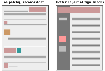 Settle on as few heading styles and subtitles as are necessary to organize your content, then use your chosen styles consistently. The fact that HTML provides six levels of headings doesn't mean that you should ever use six levels of headings in a single page. This whole manual of over 60 Web pages uses only two headers; an H2-level page title, and boldface subtitles. Manipulating text blocks Text on the computer screen is hard to read because of the low resolution of today's computer screens, but also because the layout of most Web pages violates one of the most basic rules in book and magazine typography: the lines of text in most Web pages are much too long to be easily read. Magazine and book columns are narrow for physiologic reasons: at normal reading distances the eye's span of movement is only about 8 cm (3 inches) wide, so designers try to keep dense passages of text in columns no wider than reader's comfortable eye span. Wider lines of text require the readers to move their heads slightly, or strain their eye muscles to track over the long lines of text. Unfortunately most Web pages are almost twice as wide as the viewer's eye span, so extra effort is required to scan through those long lines of text. If you want to encourage your Web site users to actually read a document online (as opposed to printing it out for later reading), consider using the "BLOCKQUOTE" or "PRE" HTML tags to shorten the line length of text blocks to about half the normal width of the Web page. References
|
|
Send mail to siagus@programmer.net with
questions or comments about this web site.
|