|
| |
There are fundamental rhetorical and organizational reasons
for subdividing any large body of information, whether it is delivered on
the printed page or in a World Wide Web site. Underlying all
organizational schemes are the limitations of the human brain in holding
and remembering information. Cognitive psychologists have known for
decades that most people can only hold about four to seven discrete chunks
of information in short-term memory. The goal of most organizational
schemes is to keep the number of local variables the reader must keep in
short-term memory to a minimum, using combination of graphic design and
layout conventions along with editorial division of information into
discrete units. The way people seek out and use information also suggests
that smaller, discrete units of information are more functional and easier
to navigate through than long, undifferentiated units. |
 Most Web sites
contain reference information that people seek in small units. Users
rarely read long contiguous passages of text from computer screens, and
most people who are seeking a specific piece of information will be
annoyed to have to scan long blocks of text to find what they are after.
Small chunks of related information are also easier to organize into
modular units of information that all share a consistent organization
scheme that can form the basis for hypertext links within your Web site.
"Small" can only be determined in the context of your presentation and
what you expect of the audience. In this style manual our expectation is
that most people will print these pages and read them from paper
"off-line," so we have tried to divide the manual into Web pages that will
print as logical units. Most Web sites
contain reference information that people seek in small units. Users
rarely read long contiguous passages of text from computer screens, and
most people who are seeking a specific piece of information will be
annoyed to have to scan long blocks of text to find what they are after.
Small chunks of related information are also easier to organize into
modular units of information that all share a consistent organization
scheme that can form the basis for hypertext links within your Web site.
"Small" can only be determined in the context of your presentation and
what you expect of the audience. In this style manual our expectation is
that most people will print these pages and read them from paper
"off-line," so we have tried to divide the manual into Web pages that will
print as logical units.
|
Steps in organizing
information
Day-to-day professional and social life rarely demands
that we create detailed hierarchies of what we know and how those bits
relate to each other, but without a solid and logical organizational
backbone your Web site will not function well even if your basic content
is accurate and well-written. The four basic steps in organizing your
information are to divide it into logical units, establish a hierarchy of
importance and generality, use the hierarchy to structure relationships
among chunks, then analyze the functional and aesthetic success of your
system.
Chunking information
Most information on the World
Wide Web consists of short reference documents that are read
non-sequentially. This is particularly true of educational, corporate,
government, and organizational web sites used to distribute information
that might have been printed on paper a few years ago. Writers of
technical documents discovered long before the Web was invented that users
appreciate short "chunks" of information that can be scanned and located
quickly. Short, uniformly-organized chunks of information particularly
lend them to Web presentation, because:
|
 |
Few Web users
spend time reading long passages of text on-screen. Most users will
save long documents to disk, or print them, rather than read
extensive material online. |
|
|
Discrete
chunks of information lend themselves to Web links. The user of a
link usually expects to find a specific unit of related information,
not a whole book's worth of information to filter through. But don't
subdivide your information too much, or you will frustrate your
readers. One to three (printed) pages of information seems about
right for a discrete chunk of information on the Web. A link that
produces only a small paragraph of information would be silly in
most situations. |
|
|
A
uniform format for organizing and presenting your information allows
users to apply their past experience with your site to future
searches and explorations, and allows users to predict how an
unfamiliar section of your Web site will be organized. |
|
|
Concise
chunks of information are better suited to the computer screen,
which provides a only limited view of long documents. Very long Web
pages tend to be disorienting, because they require the user to
scroll long distances, and to remember the organization of things
that have scrolled off-screen. |
The concept of a chunk of information must be flexible, and
consistent with common sense, logical organization, and the convenience of
the Web site user. Let the nature of the content suggest the best ways to
subdivide and organize your information. There will be times when it makes
sense to provide long documents in single Web pages, as integrated units
of information. Although chunks of information in online documents should
usually be kept short, it makes little sense to arbitrarily divide up a
long document. This is particularly true when you want users to be able to
print or save the document in one step.
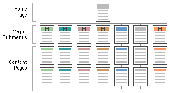
Hierarchy
Any organization needs a hierarchy of
importance, if only to determine basic navigation structures for the user.
Most "chunks" of information can and should ranked in importance, and
organized by the degree of interrelationship among units. Once you have
determined a logical set of priorities, you can build a hierarchy from the
most important or most general concepts, down to the most specific or
optional topics. Hierarchical organizations are virtually a necessity on
the Web, because most home page-and-link schemes depend on hierarchies,
moving from the most general overview of your site (your home page), down
through submenus and content pages that become increasingly more
specific.
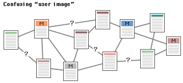
Relationships
When confronted with a new and complex
information system users begin to build mental models, and then use these
models to assess relationships among topics, and to make guesses about
where to find things they haven't seen before. The success of your Web
site as an organization of information will largely be determined by how
well your actual organization system matches your user's expectations. A
logical site organization allows users to make successful predictions
about where to find things. Consistent methods of grouping, ordering,
labeling, and graphically arranging information allow users to extend
their knowledge from pages they have visited to pages they are unfamiliar
with. If you mislead users with a structure that is not logical (or have
no comprehensible structure at all), users will be constantly frustrated
by the difficulties of find their way around. You don't want your user's
mental model of your site to look like this:
Function
After you have created your site, you
should analyze its aesthetics, and the practicality and efficiency of your
organizational scheme. No matter what organizational structure you choose
for your Web site, proper World Web site design is largely a matter of
balancing the structure and relationship of menu or "home" pages and
individual content pages or other linked graphics and documents. The goal
is to build a hierarchy of menus and pages that feels natural to the user,
and doesn't interfere with their use of the Web site or mislead
them.
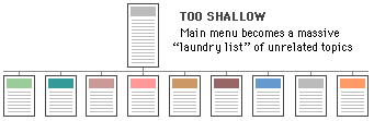
Web sites tend
to grow almost organically, and often overwhelm what was originally a
reasonable menu scheme. WWW sites with too shallow a link hierarchy depend
on massive menu pages that over time devolve into confusing "laundry
lists" of unrelated information, listed in no particular order:
Menu schemes can also be too deep, burying
information beneath too many layers of menus:
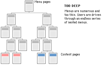
Gopher sites are the classic example of the
disadvantages of nested menus, where you sometimes have to open many
folders before you hit any content documents. Menus lose their value if
they don't carry at least four or five links; text or list-based menu
pages can easily carry a dozen links without overwhelming the user or
forcing users to scroll through long lists. Having to navigate through
many layers of nested menus before you reach any real content is
infuriating and unnecessary.
If your Web
site is actively growing, the proper balance of menus and pages is a
moving target. User feedback (and analyzing your own use of your Web site)
can help you decide if your menu scheme has outlived its usefulness or has
poorly designed areas. Complex document structures require deep menu
hierarchies, but users should never be forced into page after page of
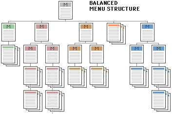
menus if direct access is possible. The goal is to produce a well-balanced
hierarchical tree that facilitates quick access to information and helps
users understand how you have organized things.
References
|
December, J., and N. Randall. 1995. The
World Wide Web unleashed. Indianapolis: Sams Publishing.
Horton, W. K. 1994. Designing and writing
online documentation, 2nd edition. New York:
Wiley. | |
| |
 
|