|
| |

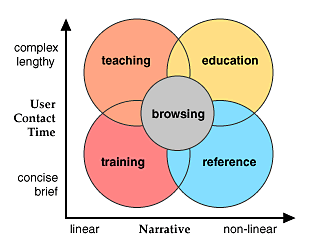
All presentations of information are governed by a few
parameters determined by your objectives, the practical logistics of the
medium you chose, and by the nature of your audience. The graphic below
plots four major themes for intranet information delivery against two
fundamental variables: how linear the structure of your presentation will
be, and how long the typical user contact time will be:
 Browsers
In the larger World Wide Web browsers ("Web
surfers") are the unmotivated readers who may blow through your home page
without an urgent mission or purpose in mind. Techniques for drawing these
potential customers into a sales or entertainment site are beyond the
scope of this manual, but you may find some guidance from these sources.
The following categories of Web use are more typical of corporate and
educational "intranet" sites where the users arrive with a more defined
purpose.
Training
Web-based training applications tend to be
very linear in design, and present few opportunities to digress from the
central flow of the presentation. Don't confuse users or confound your own
expectations by offering many links away from the central message.
Restricting the links to "Next" and "Previous" paging functions guarantees
that everyone sees the same presentation, and allows you to make more
accurate predictions of user contact time. Most training presentations
assume a contact time of less than one hour, or are broken up into
sessions of an hour or less. Inform your users about how long the session
will last, and warn them not to digress away from the required material if
they are to get credit for the training. Training applications typically
require a user log-in, and often present forms-based quiz questions in
true/false or multiple-choice formats. User log information and scores are
typically stored in a database linked to the Web site.
Teaching
Good teaching applications are
also built around a strong central narrative, but typically offer more
opportunities for students to pursue interesting digressions from the main
themes of the Web site. The information presented is usually more
sophisticated and in-depth than in training applications. Links are the
most powerful aspect of the Web, but they can also be a distraction that
may prevent your students getting through the basic presentation. If you
want to provide students with links to other Web-based resources beyond
your local site you might consider grouping the links on a page separate
away from the main body of the material. Often users will want to print
the material from the Web and read it later from paper. Make this easy for
them by providing a "printing" version that consolidates many separate
pages into one long page.
Education
The audiences for heuristic, self-directed
learning will chafe at design strategies that are too restrictive and
linear. Often the typical user is already highly educated. Flexible,
interactive, non-linear design structures are ideal for these users,
because it is so difficult to predict exactly what topics will most
interest an experienced professional or graduate student. The design must
allow fast access to a wide range of topics, and is typically very dense
with links to related material within the local Web site and beyond on the
World Wide Web. Text-based lists of links work well here for tables of
contents and indexes because they load fast and are dense with
information, but this audience is also easily bored and needs the frequent
stimulation of well-designed graphics and illustrations to stay involved
with the material. Contact times are unpredictable, but will often be
shorter than for training or education sites because the users are usually
under time pressure. Easy printing options are also a must for this
audience.
Reference
The best-designed reference Web sites
allow users to quickly pop into the site, find what they want, and then
easily print or download what they find. Typically there is no "story" to
tell, so the usage patterns are totally non-linear. Content and menu
structure must be carefully organized to support fast search and
retrieval, easy downloading of files, and convenient printing options.
Keep the graphics minimal to speed download times, and you may want to
investigate search software instead of relying exclusively on index-like
lists of links. Contact time is typically brief, the shorter the
better.
|
References
|
Mok, C. 1996. Designing business: multiple
media, multiple disciplines. San Jose: Adobe Press.
Netscape Authoring Resources (get authoring resources
URL)
Siegel, D. 1996. Creating killer web sites.
Indianapolis: Hayden Books. http://www.killersites.com/
Studio
Archetype | | | |

|