|
| |
Determining the proper length for any particular World Wide
Web (Web) page requires balancing four major factors:

|
 |
The relationship
between the page and screen size. |
|
|
The
particular content of your documents. |
|
|
Whether
the reader is expected to browse the content online, or to download
the documents for later reading. |
|
|
The
bandwidth available to your target audience. (e.g., how fast is
their connection to the Web?) |
Relationships between the document length and the
screen
Many human interface researchers and designers of graphic
user interfaces have noted the disorienting effect of scrolling on
computers screens. This loss of local context within scrolling computer
screens is particularly troublesome when basic navigational elements like
linkages to other local pages in the Web site disappear off-screen as the
user moves through very long pages. This argues for navigational Web pages
(home pages and menus in particular) that contain no more than about one
to two 640x480 screens worth of information, and which feature local
navigational links at both the beginning and end of the page layout. Long
Web pages require the user to remember too much information that is
currently scrolled off the screen; users easily lose a sense of context
when the navigational buttons or major links are not visible:
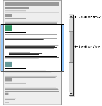
In long Web pages the user must depend on the
vertical scroll bar slider (the little box within the scroll bar) to
navigate. In most graphic interfaces (Macintosh, Windows 3.1) the scroll
bar slider is also fixed in size, and provides little indication of the
document length relative to what's currently visible on the screen, so the
user gets no visual cue to page length. In very long Web pages small
movements of the scroll bar can completely change the contents of the
screen, leaving no familiar landmarks to orient by. This gives the user no
choice but to crawl downward with the scroll bar arrows, or risk missing
sections of the page.
However, long
Web pages are often easier for managers to organize, and for users to
download. Web site managers don't have to maintain as many links and pages
with longer documents, and users don't need to download multiple files to
collect information on a topic. Long pages are particularly useful for
providing information that you don't expect users to read online
(realistically, that should include any document longer than two printed
pages). If the Web pages get too long, or contain too many inline
graphics, the pages can end up taking too long to download. Very large Web
pages with lots of graphics can also overwhelm the RAM memory limitations
of the Web browser.
Mirror the structure of your content
It makes sense
to keep closely related information within the confines of a single Web
page, particularly when you expect the user to print or save the text.
Keeping the content all in one place makes printing or saving easier.
However, once you get beyond about four screens worth of information the
user must scroll so much that the utility of the online version of the
page begin to deteriorate. Long pages often fail to take full advantage of
the linkages available in the Web medium.
If you want to
provide both a good online interface for pages and easy printing or saving
of the content:
|
|
Divide the page up
into chunks of two to three printed pages worth of information,
including inlined graphics or figures. Use the power of hypertext
links to take full advantage of the Web medium. |
|
|
Provide
a link to a separate file that contains the full-length text
combined into one page, designed so the reader can print or save all
the related information in just one step. Don't forget to include
the URL of the online version within the text of that page so users
can find updates and correctly cite the page
source. |
Modular design of online collections of pages
One of
the primary advantages of online documents is that they can be rapidly
updated. In practice the editor or "webmaster" of a large Web site is
constantly swapping in new updated files for old ones. In a well-designed
modular system pages covering particular topics can be updated quickly
without needing to change large sections of information or re-format
complex pages. The page length may increase in a modular system, but the
URL of each topic page remains the same, regardless of how long the page
grows. Thus modular systems are better when you want to give your readers
a sense of stability (the URLs of major pages remain constant) , even
while your Web site expands. The concept is essentially similar to the
loose-leaf procedural manuals most organizations use to keep paper
documents reasonably up to date by replacing old sections for new, except
that Web systems offer much more flexible and economical means of keeping
information current.
In general, you should favor shorter Web pages
for:
|
|
Home pages, and
menu or navigation pages elsewhere in your site. |
|
|
Documents to be
browsed and read online. |
|
|
Pages
with very large graphics. |
In general, longer documents are:
|
|
Easier to maintain
(they are all in one piece, with fewer links). |
|
|
More
like the structure of their paper counterparts (not chopped
up). |
|
|
Much
easier for users to download and
print. |
References
|
Horton, W. K. 1994. Designing and writing
online documentation, 2nd edition. New York: Wiley.
Mullet, K., and D. Sano. 1995. Designing
visual interfaces. Englewood Cliffs, NJ: SunSoft Press-Prentice
Hall.
Norman, D. A. 1993. Things that make us smart.
Reading, MA: Addison-Wesley.
Shneiderman, B. 1992. Designing the user interface:
Effective strategies for effective human-computer interaction. 2nd
ed., Reading, Mass.:
Addison-Wesley. | | |
 
|