|
| |
The primary challenge in creating illustrations for
Web pages is the relatively low resolution of the computer screen. But
these days computer screens can also display thousands or millions of
colors, and that wealth of color can often make the resolution limitations
less noticeable.
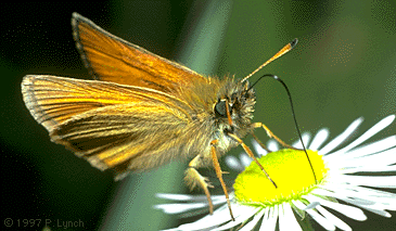
 Very complex graphics or color photographs often look surprisingly
good on Web pages for two major reasons: Very complex graphics or color photographs often look surprisingly
good on Web pages for two major reasons:
|
 |
True-color
(24-bit) or high-color (16-bit) displays show enough colors to
accurately reproduce photographs or complex art. |
|
|
The transmitted light
from display monitors shows more dynamic range and color intensity
than light reflected from printed
pages. |
Science and education users are just waking up to the
fact that digital publishing is inherently color publishing  on the Web there is no economic penalty for publishing
in color. Web pages may be the best current means to distribute color
photography it's a lot cheaper than color printing, and is also
more consistent and reliable than all but the most expert (and costly)
color printing: on the Web there is no economic penalty for publishing
in color. Web pages may be the best current means to distribute color
photography it's a lot cheaper than color printing, and is also
more consistent and reliable than all but the most expert (and costly)
color printing:
The Web is also great for transmitting complex color
artwork to students:
Processing complex illustrations or
photographs
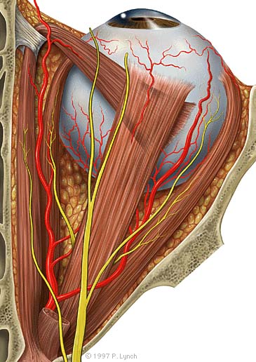
The anatomic graphic above was originally painted at
much higher resolution in Adobe Photoshop (1000 by 2000 pixels, 24-bit RGB
file). We then reduced a copy to the size above, and used the Photoshop
"Unsharp Mask" filter (at 60%) to restore the sharpness of the graphic.
Although this small version of the painting has lost some resolution and
color detail, it still shows all the major anatomic landmarks. We think it
is just as good as any equivalent graphic printed in a textbook.
We chose the JPEG file format for the anatomic painting because
the artwork is relatively large for a Web graphic. It also does not
contain any lettering or diagrammatic elements that reproduce poorly in
highly compressed JPEG images. JPEG images can be used for paintings or
photographs with labels if you choose the right compression setting. The
painting above was compressed in Photoshop at "good" quality," which is
the medium setting ("excellent, good, poor"). If you choose the "good" or
"excellent" JPEG compression settings text labels may look acceptable, at
least on 16-bit or 24-bit displays. Note that the text of the signature is
clear and legible, even though close inspection shows there is JPEG noise
around the characters. All other graphics on this page are in GIF format,
either because they are smaller, or because they contain text or diagram
elements.
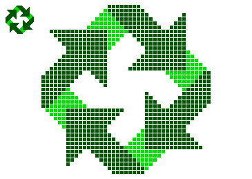
Diagrams for the computer screen
Basic
diagrams also work well on the computer screen if they are carefully
designed to match the grid of pixels on the screen. Graphics built with
orthogonal lines (straight horizontal or vertical lines) or diagonal lines
at 45 degree angles work best for the screen, as this enlarged view
illustrates:
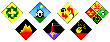
Complex icons are hard to interpret, and look mushy
and confusing on the screen. Keep your icons and navigation graphics as
simple as possible:
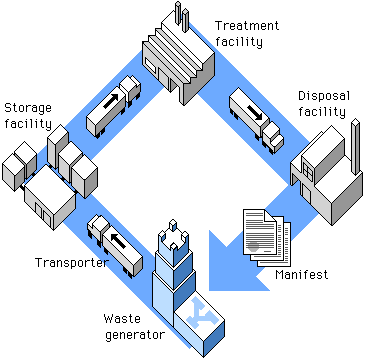
Simple isometric perspective graphics also work well,
because they depend on straight lines and 45 degree diagonals.
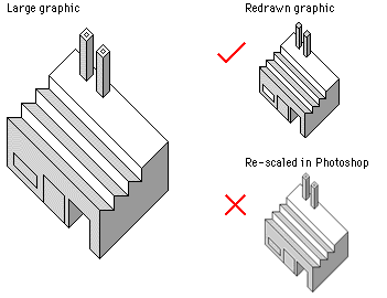
Graphics built carefully to match the pixel grid
cannot be resized automatically in Photoshop they must be re-drawn by hand to larger or smaller
sizes to avoid a mushy, fuzzy look that destroys their
effectiveness:
Always use the GIF graphic format for diagrams,
navigation graphics, or any graphic that contains text. | |
 
|