|
| |
There is no single design grid system that is appropriate
for all Web pages. The first consideration in a Web design project is to
establish the basic layout grid for your pages. With this graphic
"backbone" you establish how the major blocks of type and illustrations
will regularly occur in your pages, and set the placement and style
guidelines for major screen titles, subtitles, and navigation links or
buttons. To start, gather representative examples of your text, along with
some graphics, scans, or other illustration material, and experiment with
various arrangements of the elements on the page. In larger projects it
isn't possible to predict how every particular combination of text and
graphics will interact on the screen, but examine your Web layout
"sketches" against both your most complex and least complex pages.
 The goal
is to quickly establish a consistent, logical screen layout, one that
allows you to quickly "plug in" text and graphics for each new page
without having to stop and re-think your basic design approach for every
new page. Without a firm underlying design grid, your project's page
layout will be driven by the problems of the moment, and the overall
design of your Web system will look patchy and visually confusing. The goal
is to quickly establish a consistent, logical screen layout, one that
allows you to quickly "plug in" text and graphics for each new page
without having to stop and re-think your basic design approach for every
new page. Without a firm underlying design grid, your project's page
layout will be driven by the problems of the moment, and the overall
design of your Web system will look patchy and visually confusing.
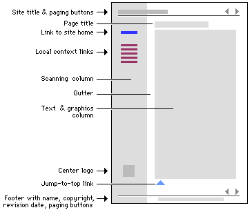
Analyzing page grids
When we designed this
style manual we used a basic page grid that incorporates an image map menu
at the top and bottom of every page incorporating paging buttons. A "scan
column" along the left of the page does two jobs: it provides space for
local links to related material, and also gives visual relief by narrowing
the right text column to about 60 - 70 characters per line. This diagram
shows the major repeating components of the style manual pages:
Here we show the "invisible" table (BORDER="0") that
underlies the column structure of the page, and the critical page
dimensions:
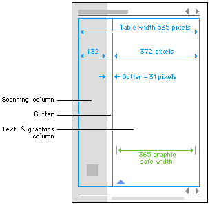
We chose 535 pixels as the maximum dimension for the
page layout because that is the widest table that will print on standard
letter size or A4 paper (although, given variations in Web broswers,
fonts, and laserprinters, some slight cropping may occur.). With a few
exceptions, all graphics for this manual were designed to fit within the
365 pixel "safe area" of the text column. If you view the source code for
these style guide pages you will see that the table structure we finally
ended up with is quite complex. The example page below shows a similar but
highly simplified table-based layout with a scan column and a text colum.
For illustrative purposes we set the table border to "1" so you can see
the edges of the table:
Simple table-based page layout example.
To modify this example for your own use, click the
link to open the page, then use your browser's "View source code" option
to view and copy the HTML code. | |
 
|

